
THE STUDIO NOTES
Home > THE STUDIO NOTES
THE STUDIO NOTES
Architecture · Interiors · Spaces · Living
Beautiful spaces begin with good ideas.
The Studio Notes is our collection of ideas, observations and inspiration from the world of architecture and interiors — exploring how we design and the details that shape the spaces we transform.
From thoughtful layouts and natural light to colour, materials and everyday living — notes on what makes a space beautifully considered.
When a space does more than look beautiful.
Designing for Well-Being
There is a particular feeling when you walk into a space that simply feels right.
The light is soft. The proportions feel comfortable. There is somewhere to gather, somewhere to retreat, and nothing seems to be working too hard for your attention.
Often, we notice the feeling before we notice the design.
For many of us, home now carries more of everyday life than ever before. It is where mornings begin and working days sometimes unfold; where dinner is shared, conversations happen and quieter moments are found.
So perhaps the question isn’t simply how do we make a space beautiful?
It is: how do we design a space that feels good to live in?
The Feeling of a Room
Well-being is often shaped by the quietest design decisions — natural light, comfortable proportions, warm materials, thoughtful lighting and effortless flow.
Individually, they may feel subtle. Together, they create something much greater: Atmosphere.
FROM OUR STUDIO
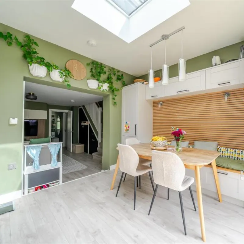
Knighton Close Project — A Home Designed Around Living
WWhen we began Knighton Close, we looked beyond how the house should appear and considered how a young family would actually live within it — working, gathering, retreating and simply being at home.
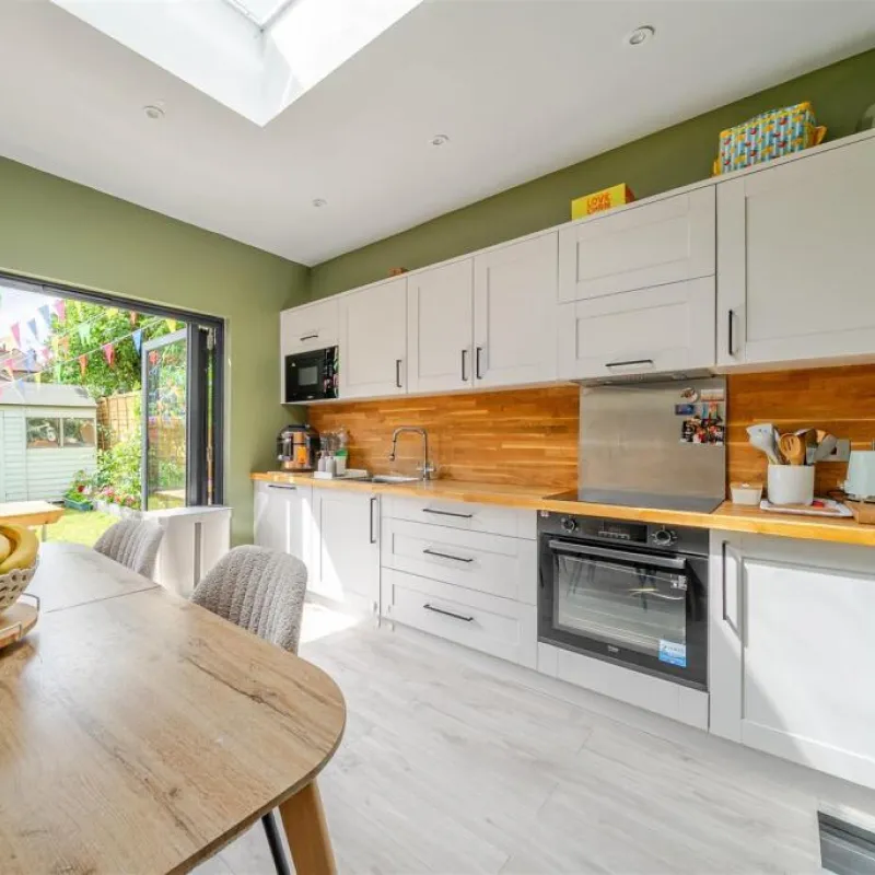
Open-plan kitchen and dining spaces form the social heart, while rooflights, generous glazing and garden connections bring daylight deep inside. Quieter rooms and dedicated workspaces offer moments of separation when needed.
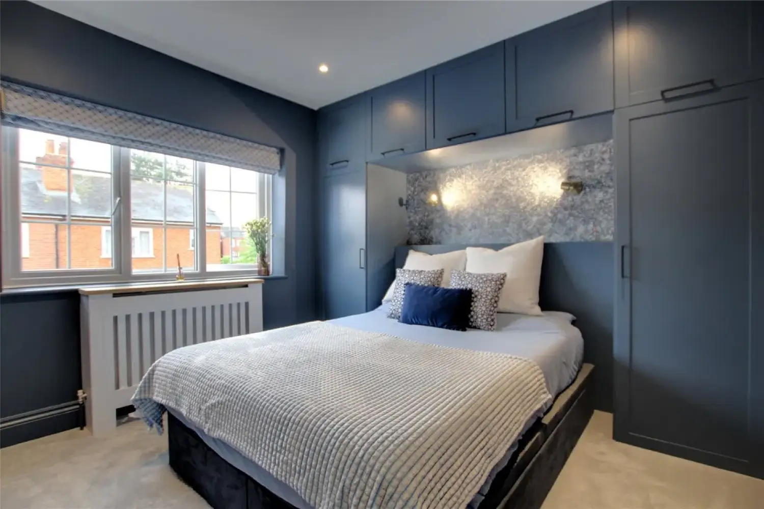
Sage and olive greens, deeper blues, warm timber and botanical details bring personality, while integrated storage keeps practicality beautifully considered.
A little bold. A little playful. Calm where it matters — a home where character and everyday living belong together.
Beauty, With Purpose
Beauty in design isn’t simply the final layer. It begins with how a space works.
The position of a doorway. The direction of light. The relationship between kitchen and dining. A quiet corner designed for retreat.
Different homes ask for different things, but the principle remains the same: design around the way people live, and beauty begins to have purpose.
Because the most memorable spaces don’t always make the biggest statement.
Sometimes, they simply make us feel at home.
FROM YOUR VISION TO YOUR SPACE
YOUR PROPERTY. OUR NEXT IDEA?
Have a home, HMO or property you’re thinking about transforming? Bring us the starting point — we’ll help explore what the space could become.
Less, But Warmer
The New Minimalism
Minimalism was never really about having nothing. It is about knowing what belongs.
Today, its edges are softening. Stark whites and cool surfaces are making room for natural timber, earthy greens, tactile details and warmer light.
The result is a quieter kind of design — less visual noise, more feeling.
Beyond the Bare
The new minimalism isn’t empty. It’s intentional.
A restrained palette lets materials breathe. Furniture has purpose. Colour creates atmosphere rather than clutter. And underneath it all, proportion, daylight and flow quietly do the work.
Simple, yes. But never without character.
FROM OUR STUDIO
Curzon Street Project – A Study in Green & Timber
At our Curzon Street Project, simplicity became the backdrop for warmth.
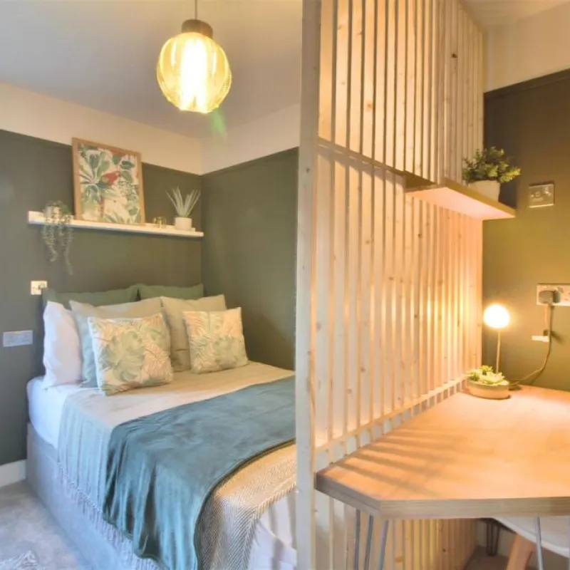
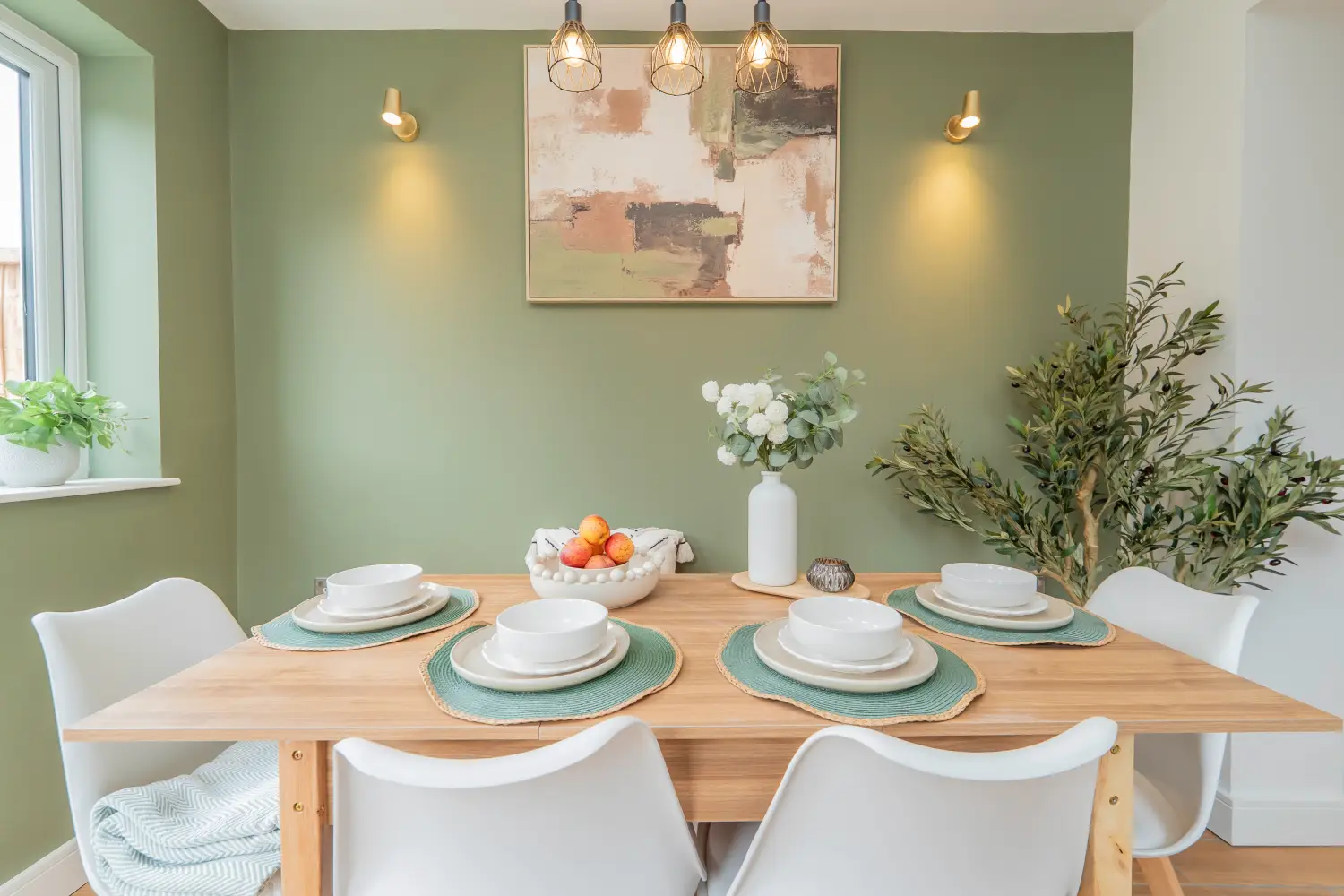
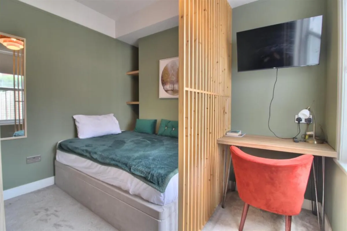
Soft sage and olive tones move through the bedrooms and communal spaces, paired with warm timber surfaces, crisp white joinery and clean architectural lines. Rather than filling the rooms, we allowed daylight, material and carefully chosen details to create the atmosphere.
A desk beneath a generous window. Timber against muted green. A dining space defined by light rather than decoration.
Each gesture is simple, but together they make the spaces feel calm, considered and lived-in.
Minimal, but never bare. Contemporary, but comfortably so.
Designing Less, Feeling More
Perhaps that’s the new luxury: not more, but enough — beautifully chosen.
Less, but warmer.
Less, but more personal.
Less, with purpose.
Written from the Studio
Reading Design Studio · Designing Beautiful Spaces.
YOUR PROPERTY. OUR NEXT IDEA?
Have a home, HMO or property you’re thinking about transforming? Bring us the starting point — we’ll help explore what the space could become.
When beautiful spaces begin to think beyond today.
Designing for a More Sustainable Life
The sun has always been part of architecture.
It shapes where morning light falls, how a room changes through the day and the way a home feels from one season to another.
Now, we are asking it to do something more: help power the spaces we live in.
In March 2026, the UK passed two million solar installations, and nearly 172,000 more installations were recorded between January and July — including more than 22,600 in the South East.
It signals something larger than a change in technology. It is a change in how we think about home.
Designing with the Sun
Sustainable design begins long before technology is added.
Orientation, daylight, materials, energy and longevity are all part of the architecture. From thoughtful glazing and solar PV to durable finishes and considered layouts, each decision can help a home work more intelligently over time.
The best sustainable features don’t dominate the design.
They simply become part of how the home works.
FROM OUR STUDIO
Wilson Road Project – A House Designed to Use Less
At Wilson Road Project, sustainability became part of the design language — not something added once the architecture was finished.
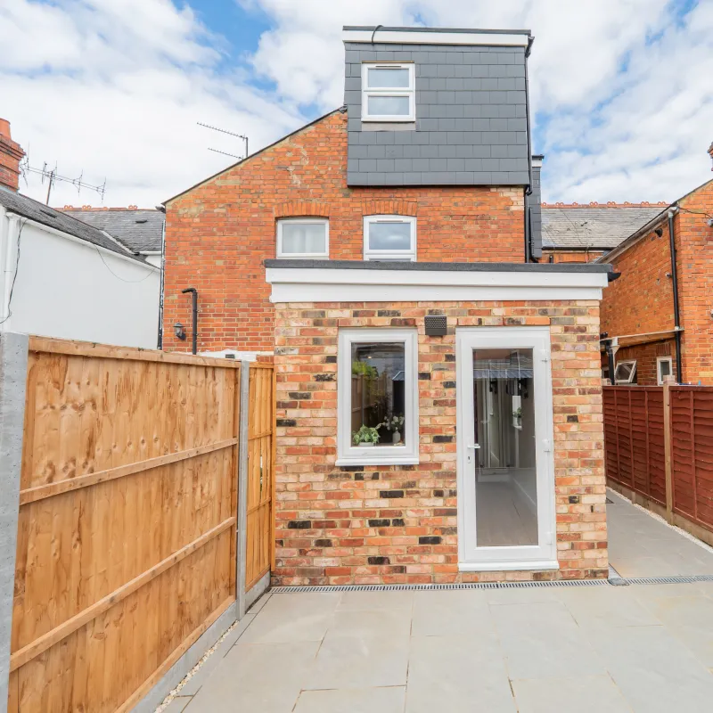
As we reimagined the property into a five-bedroom shared home, we considered more than layouts and finishes. Light, insulation, heating, energy use and the way each space would perform day to day became part of the same design conversation.
The result is an EPC A-rated home, where energy-conscious choices sit quietly alongside warm materials, comfortable bedrooms and a generous communal kitchen and dining space.
For an HMO, these decisions can work on several levels. Reducing energy demand can help lower running costs, while renewable technologies such as solar can further reduce reliance on electricity from the grid. Where utilities are included within the rent, those efficiencies can help protect more of the property’s income from being absorbed by energy bills.
Beauty + Responsibility
Perhaps this is where residential design is heading: towards homes that are not only beautiful to experience, but more intelligent in the way they use energy, materials and resources.
Good sustainable design goes beyond economics. It is about designing with responsibility — reducing environmental impact while creating comfortable, considered spaces that support the people living within them.
For us, innovation isn’t about adding technology simply because it is available. It is about allowing architecture, interiors and evolving technologies to work as one — where energy-conscious decisions sit naturally alongside light, material, proportion and everyday comfort.
The result is a home that looks considered, feels beautiful to live in and works intelligently behind the scenes — designed for life today, with tomorrow already in mind.
Beautiful spaces. Smarter homes. A more sustainable way of living.
Written from the Studio
Reading Design Studio · Designing Beautiful Spaces.
Resources:
Solar Roadmap — UK Government Read the UK Solar Roadmap
Britain Continues to Break Clean Power Records — UK Government Read the latest solar statistics
First Regional Solar Breakdown — UK Government Explore the regional solar data
YOUR PROPERTY. OUR NEXT IDEA?
Have a home, HMO or property you’re thinking about transforming? Bring us the starting point — we’ll help explore what the space could become.
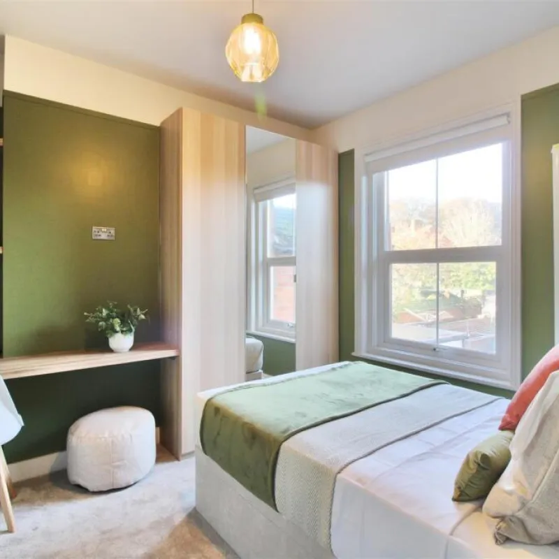
How the right colours can completely change the way a room feels.
The Art of the Colour Palette
We analyse the colours we wear. So why not the colours we live in?
Colour analysis is having a moment – Spring. Summer. Autumn. Winter. We analyse undertones, compare warm against cool and search for the colours that make us look — and feel — most like ourselves.
But what if we turned that same idea towards our homes?
After all, these are the colours we actually live with.
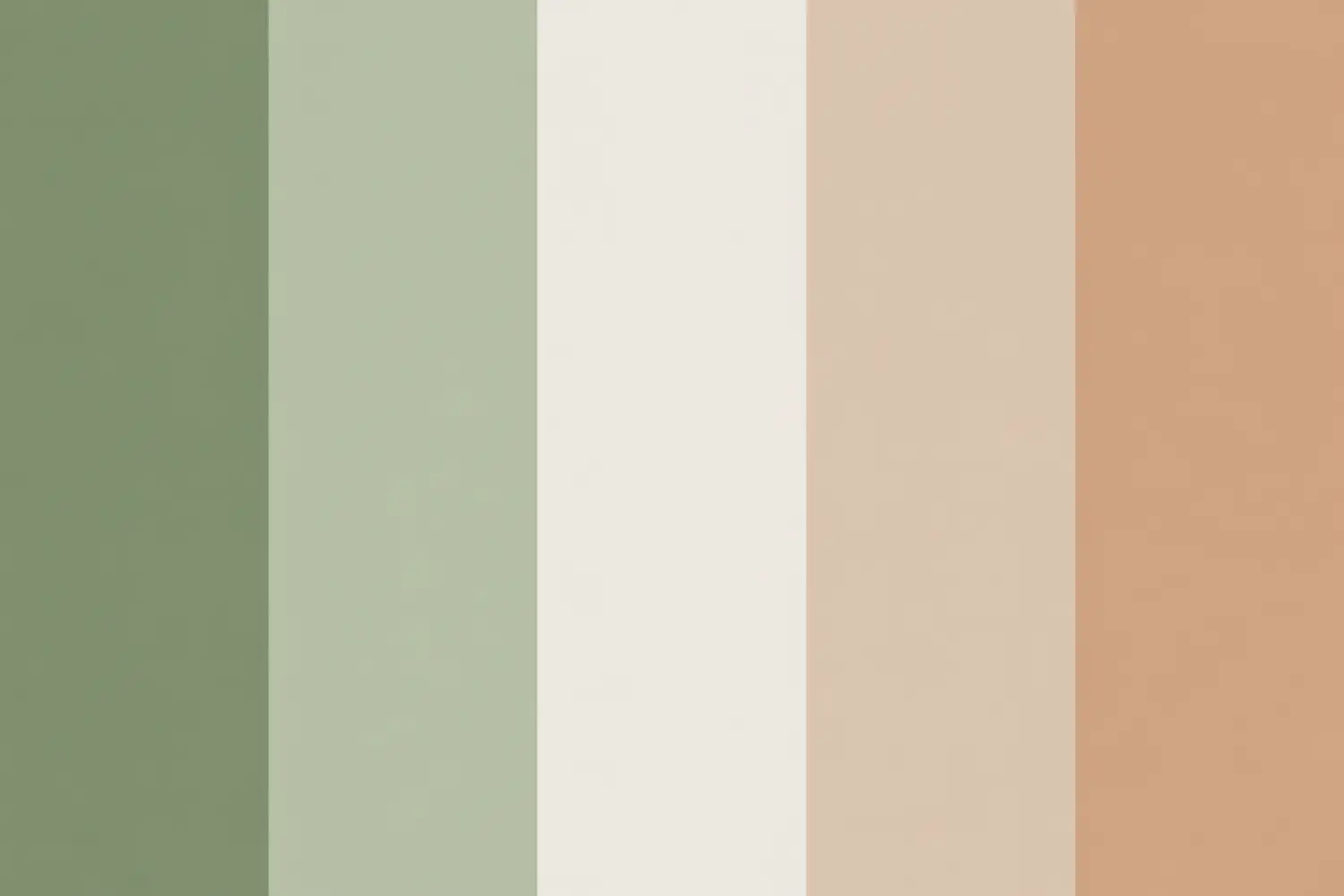
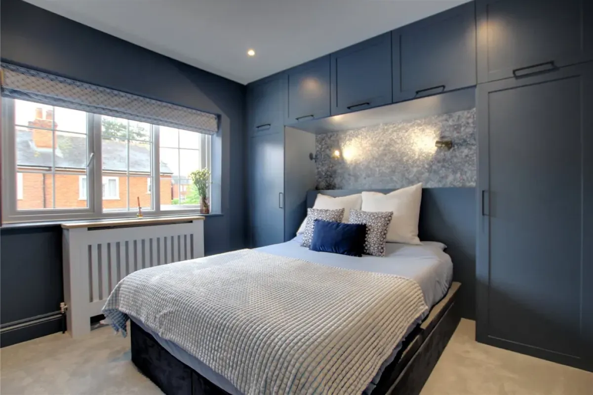
Colour shapes more than how a room looks — it shapes how it feels. Deep blues can feel cocooning, sage greens soft and calming, while warm neutrals let light and texture take the lead.
But colour is deeply personal. What feels quiet to one person may feel expressive to another.
After all, colour is in the eye — and feeling — of the beholder.
What's Your Colour?
Personal colour analysis may inspire the idea, but interiors tell a different story.
In architecture and design, we consider the same language of undertone, contrast, balance and harmony — shaped by light, materials and the character of the architecture.
Because our canvas isn’t a wardrobe.
It’s the space we live in.
And Sometimes, It's Personal
Colour can be practical, emotional — or both.
A home office shade that looks good on camera. If it makes Monday morning look slightly kinder, even better. A calming bedroom, a bright sociable kitchen, or simply a colour that feels unmistakably you.
And sometimes, colour is sentimental.
The green your partner loves — because apparently he’ll paint in your favourite colour, just so the room can match your eyes. (Alexa, play “That’s How You Know” by Amy Adams.) The blue that reminds you of somewhere you’ve travelled together. A shade borrowed from a childhood home — because sometimes colour is nostalgia in disguise, quietly taking us back to a place, a person or a moment you once loved. (Alexa, play “The Night We Met.” Apparently, we’re not just choosing paint anymore)
Kidding aside, colour is personal. It holds memories, moods and pieces of who we are. Perhaps that’s why the best palettes aren’t simply chosen — they’re felt.
FROM OUR PALETTE
Colour Stories from the Studio
Every project develops its own visual language — because every space has a different character.
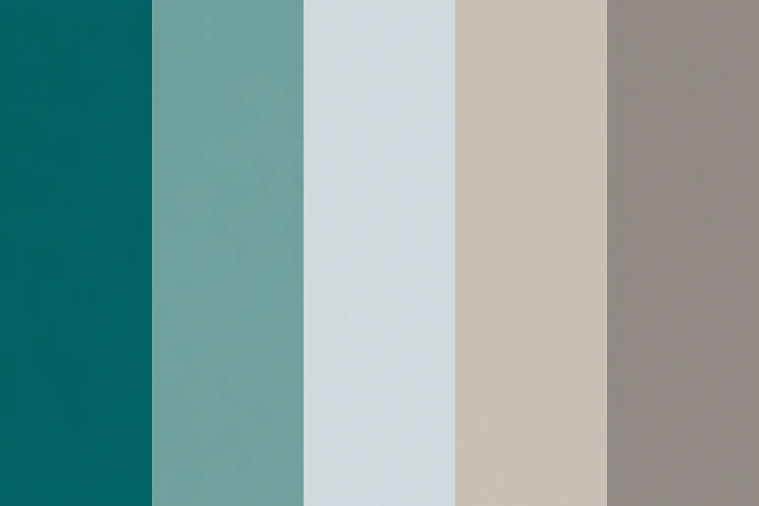
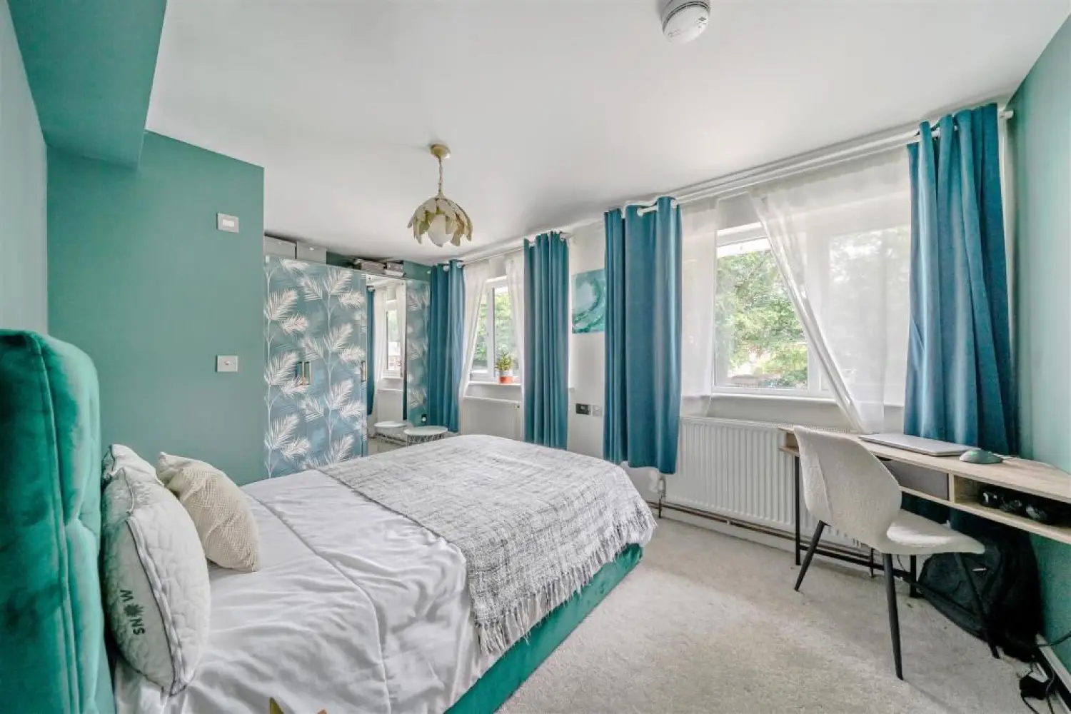
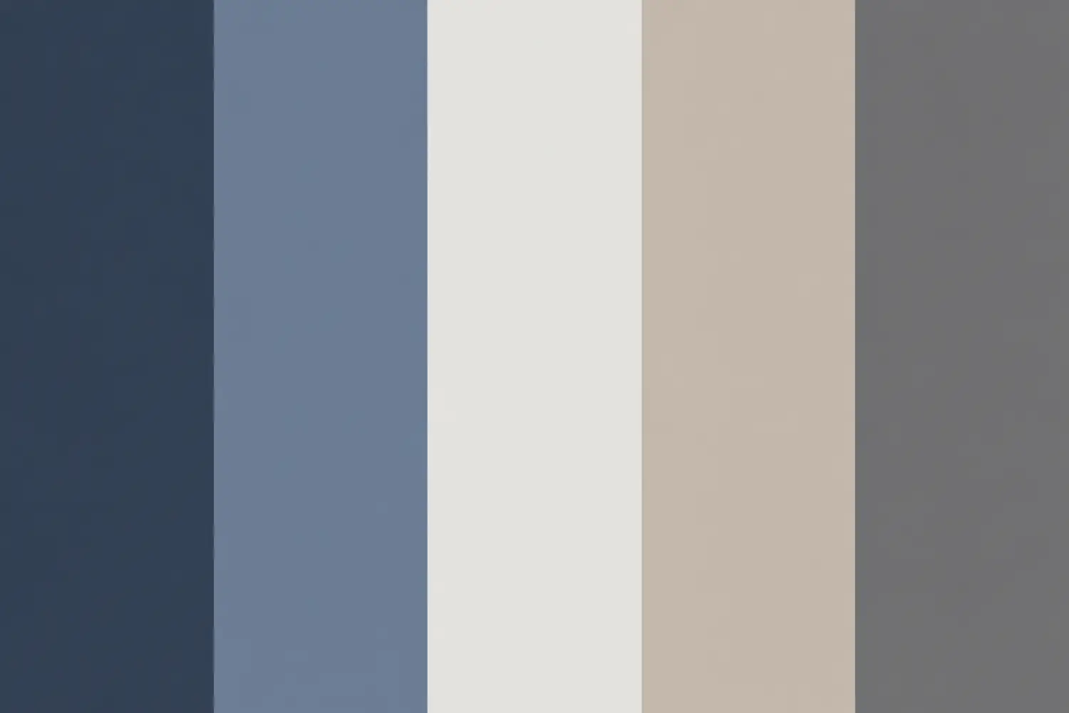
From earthy greens paired with warm timber, to deeper blues softened by neutrals, or botanical accents layered against crisp joinery, our palettes are shaped by architecture, natural light and the mood we want the space to hold.
Different personalities. Different palettes. Different ways of feeling at home.
Beyond the Swatch
Perhaps choosing a colour palette isn’t about finding the perfect shade, but finding what feels right to you.
Calm or expressive. Light or cocooning. Earthy or playful. A colour that lifts your mood, holds a memory, or simply makes you look good on camera.
After all, colour is in the eye — and feeling — of the beholder.
The best palettes respond to the architecture, the light and, most importantly, the people who call the space home.
So, what about you?
What’s your palette?
Written from the Studio
Reading Design Studio · Designing Beautiful Spaces.
YOUR PROPERTY. OUR NEXT IDEA?
Have a home, HMO or property you’re thinking about transforming? Bring us the starting point — we’ll help explore what the space could become.
Colour, Character & Child-Friendly Design in Reading
From Functional to Fun: A School Bathroom Transformation
There are spaces architects love to talk about.
Grand entrances. Light-filled kitchens. Beautiful staircases.
School toilets don’t usually make the list.
But perhaps they should.
When Reading Design Studio had the opportunity to redesign the children’s bathrooms at Caversham Preparatory School, we wanted to give one of the school’s most practical little spaces something it was missing:
A little joy.
And because this was a project for the local school community, we provided our design work free of charge.
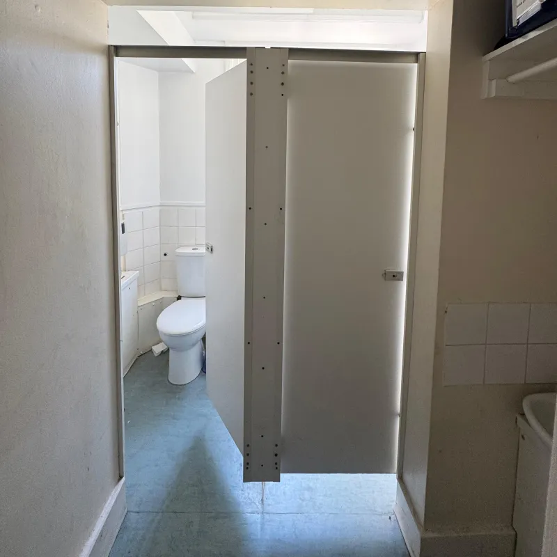
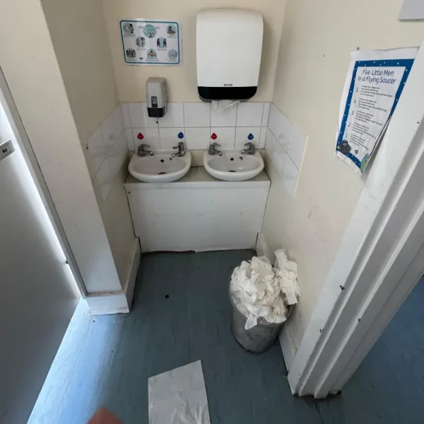
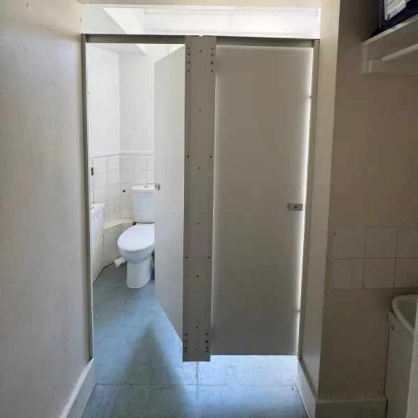
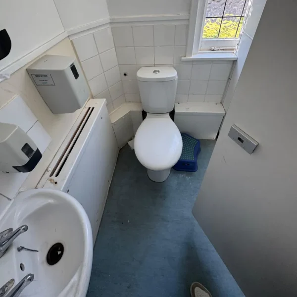
BEFORE
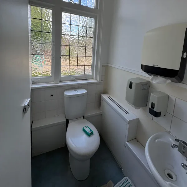
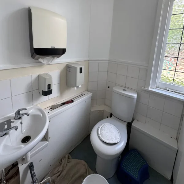
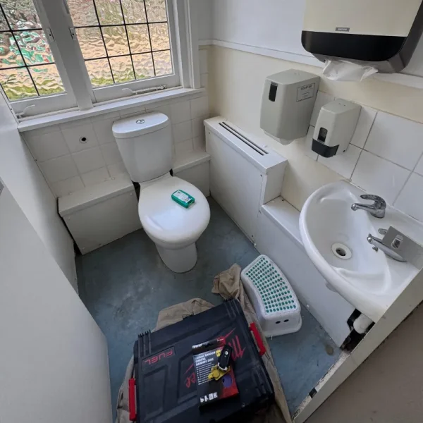
The original bathrooms were practical, but undeniable clinical.
White tiles. White sanitaryware. Very little colour.
Everything worked — but nothing really spoke to the personalities of the children using the space.
And school bathrooms matter more than we might think.
Research from UK children’s bowel and bladder charity ERIC found that 24% of young people surveyed felt scared to use their school toilets, while 51% described them as dirty.
ERIC also advises that children should have access to facilities that are clean, safe and comfortable to use, noting that some children may avoid eating or drinking when toilets feel poorly maintained, lack privacy or are difficult to access.
It made us think about an often-overlooked design question:
Design at Their Eye Level
Our answer started with colour, character and a little imagination.
Rather than treating the bathrooms like miniature adult interiors, we introduced a playful visual language designed around their youngest users.
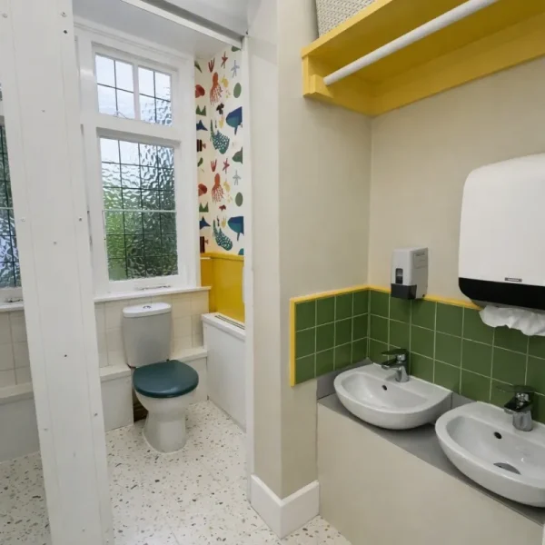
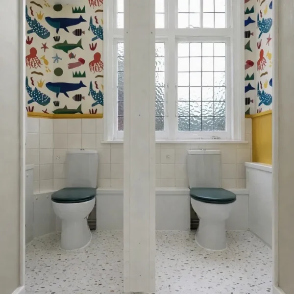
A colourful illustrated wall brings animals, playful forms and moments of discovery into the room, transforming the previously neutral interior into something distinctly child-friendly. A calm foundation of warm greige, crisp white and terrazzo-effect flooring is layered with forest-green tiles, mustard accents and expressive pattern. Concentrating the bolder graphics around the WC area creates a clear visual focal point, while the quieter surrounding finishes keep the compact space balanced and considered.
The existing architecture didn’t need to become complicated.
It simply needed to feel like it belonged to them.
THE PALETTE
Warm Greige · Forest Green · Mustard · Deep Blue · Terracotta · White
THE MATERIALS
Terrazzo-effect flooring · Ceramic wall tiles · Painted joinery · Illustrated wall covering · White sanitaryware · Obscured glazing
THE DESIGN LANGUAGE
Playful · Practical · Graphic · Child-Centred
AFTER
A Little Room With a Lot More Character.
The transformation is intentionally simple. The bathroom remains practical and easy to use, but now there is colour to notice, characters to discover and a little more joy in an everyday routine.
It is a useful reminder that interior design isn’t always about dramatic architectural interventions.
Sometimes, changing the experience of a space can begin with something as simple as understanding who’s using it.
Perhaps we created one small problem…
The bathrooms might now be too inviting.
We wouldn’t be surprised if “Miss, can I go to the toilet?” suddenly becomes a little more popular — even in the middle of class. For design appreciation, naturally.
Sources: Desperate to go: Young People struggling access to toilets at school by ERIC
A Little Room With a Lot More Character.
The transformation is intentionally simple. The bathroom remains practical and easy to use, but now there is colour to notice, characters to discover and a little more joy in an everyday routine.
It is a useful reminder that interior design isn’t always about dramatic architectural interventions.
Sometimes, changing the experience of a space can begin with something as simple as understanding who’s using it.
Perhaps we created one small problem…
The bathrooms might now be too inviting.
We wouldn’t be surprised if “Miss, can I go to the toilet?” suddenly becomes a little more popular — even in the middle of class. For design appreciation, naturally.